How FFT Turns Audio Into Visualizer Bands
What a Fast Fourier Transform actually measures in a song, how AnalyserNode bins become bass/mid/treble, and why those numbers drive every audio-reactive canvas.
Novus Team9 min read
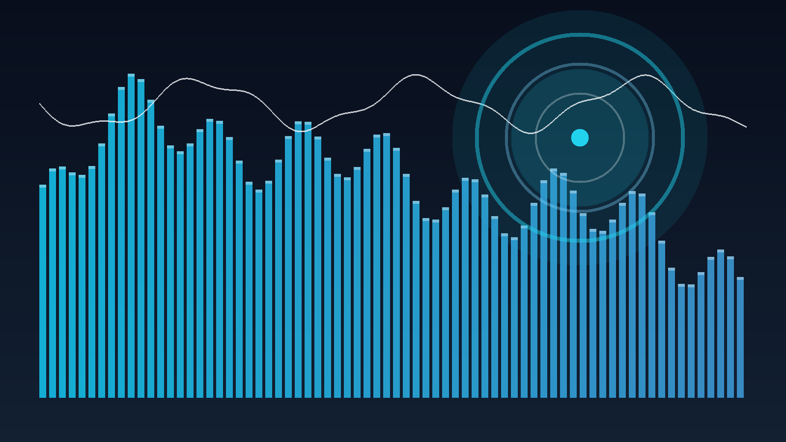
If you have ever wondered how audio visualizers work, the short answer is not “magic bars.” It is a repeating measurement: take a short window of the waveform, run a Fast Fourier Transform (FFT), and draw something that reflects the result. This post is the FFT half of that loop — what the transform actually returns, how browsers expose it, and how visualizer engines collapse hundreds of bins into bass, mid and treble. The drawing half is How Canvas Paints an Audio Visualizer.
Novus’s own one-line definitions live in the glossary. This article is the longer explainer those Search Console queries were asking for: not a product tour, and not a DSP textbook — just enough signal processing to tune a scene on purpose.
The waveform is time; the FFT is frequency
A digital audio file is a list of pressure samples over time — a single wiggly line. That line is useful if you want an oscilloscope, and Novus’s Waveform engine draws it. Most visualizers want a different question: which pitches are loud right now? An FFT answers that. It takes one slice of the waveform and returns a spectrum: energy versus frequency, from sub-bass on the left to air and cymbals on the right.
The companion post How Music Visualizers Work walks the whole measure-then-draw loop. Here we stay inside the measurement. If you only remember one sentence: the FFT does not invent musical notes — it reports how much energy sits in each frequency slot of the current window.
What a frequency bin actually is
The spectrum is not a continuous rainbow. It is a row of frequency bins — fixed-width slots. More bins means finer pitch detail and a busier picture; fewer bins means a smoother, calmer shape. In the browser the slot count is controlled by AnalyserNode.fftSize (a power of two). frequencyBinCount is half of that, because a real signal’s FFT is symmetric.
- Bin 0 sits at DC / near-silence energy — rarely useful for a kick drum.
- Low bins cover kick, bass and sub. They are wide in musical terms at the bottom of a linear FFT.
- High bins cover hats, air and noise. Linear Hertz spacing puts a lot of slots up here relative to how we hear pitch.
Linear Hertz is not how hearing works
A linear FFT spends equal width on 200–400 Hz and on 10–10.2 kHz. Musically, the first interval is huge and the second is tiny. That is why some analysers remap onto a mel scale before drawing. Novus’s band summaries (bass / mid / treble) are the practical compromise most scenes want: three numbers instead of hundreds of bins, still honest about which region of the spectrum moved.
How the browser exposes it: AnalyserNode
You do not implement an FFT by hand in a visualizer. The Web Audio API gives you an AnalyserNode. Connect the playing audio into it, then once per frame call getByteFrequencyData(array) (or the float variant). The array comes back filled with 0–255 magnitudes, one per bin. That is the same node Novus’s preview and export analysers read; the engine reference is downstream of those numbers, not a second audio engine.
fftSize, smoothingTimeConstant and minDecibels / maxDecibels change the feel of the spectrum before any visualizer control is touched. A high smoothing constant makes bars glide; a low one makes them twitch. Decibel range is why a quiet acoustic track and a brickwalled EDM master can both fill the frame — or why one of them pins every bar to the ceiling. The glossary calls the product-side cousins of those ideas spectral smoothing and gain.
From bins to bass, mid and treble
A full getByteFrequencyData buffer is more detail than a tunnel, a particle field or a lyric scene can use. Engines therefore collapse neighbouring bins into bands:
- Bass (roughly 20–250 Hz) — kick, sub, the weight of a drop. Typically drives scale, camera shake, emission bursts.
- Mids (roughly 250 Hz–4 kHz) — vocals and most instruments. Good for the readable “body” of a scene.
- Treble (roughly 4–20 kHz) — hats, sparkle, air. Sparks, glints, fine particles.
Those Hertz ranges are conventional, not sacred. What matters is that the same band math runs in preview and in export, so a binding you dial in the editor is the binding in the file. That contract is what deterministic export is protecting: the picture is a function of the audio window, not of whatever the GPU happened to be doing that millisecond.
See the bins before you map them
Open a Spectrum or Bars scene on a track you know. The leftmost columns are your kick; the rightmost are hats. Then open Particles or Tunnel on the same file — identical analyser, different drawing. That is the fastest way to separate “the FFT did this” from “this engine draws it that way.” The Tune Audio Reactivity tutorial has starting points per genre.
Amplitude, RMS and onset sit beside the FFT
The spectrum is not the only measurement. Peak amplitude is the loudest sample in the window; RMS is a smoother loudness. A beat in this product is really an onset — a jump in energy, usually bass, relative to the recent average. You can have a rich FFT and still miss the kick if onset detection is too slow, and you can have a perfect onset latch with a boring spectrum if the track is a sine wave. Visualizers that feel “in time” almost always combine both.
What this means when you actually tune a scene
Once you see the FFT as a row of bins, the editor controls stop being folklore:
- Sensitivity scales how hard any band is allowed to push a control. Turn it down on a compressed master; turn it up on a quiet demo.
- Attack / release (the envelope) decide how fast a mapped value may change. Fast attack for percussion; long release for pads.
- Beat response is the onset path, not the FFT path. If the kick is visible in Spectrum but invisible in Particles, look here before blaming the transform.
Every engine in the engine reference reads some combination of those measurements. The reference publishes the live control table; this article is why those controls exist. If a term in the table is still opaque, jump back to the glossary — FFT, bin, band, RMS, onset and envelope all have stable anchors there.
Try it, then draw it
Load a track in the editor, watch a spectrum scene until you can point at the kick with your eyes, then switch engine without changing the song. When you are ready for the other half of “how audio visualizers work” — the actual pixels — continue with How Canvas Paints an Audio Visualizer.
Sources
Reviewed by the editorial team. Report a correction.
Keep reading
Was this page helpful?
Anonymous. Only this page’s address and your yes/no are recorded, and only if you allowed analytics cookies.
Ready to make your own?
Open the editor, drop in a track, and export a watermark-free video — free, no account.
Open the Editor